Simple linear regression model using scikit-learn
Contents
Simple linear regression model using scikit-learn
We start with perhaps our simplest possible example, using Scikit-Learn to perform linear regression analysis on a data set produced by us.
What follows is a simple Python code where we have defined a function \(y\) in terms of the variable \(x\). Both are defined as vectors with \(100\) entries. The numbers in the vector \(\hat{x}\) are given by random numbers generated with a uniform distribution with entries \(x_i \in [0,1]\) (more about probability distribution functions later). These values are then used to define a function \(y(x)\) (tabulated again as a vector) with a linear dependence on \(x\) plus a random noise added via the normal distribution.
The Numpy functions are imported used the import numpy as np statement and the random number generator for the uniform distribution is called using the function np.random.rand(), where we specificy that we want \(100\) random variables. Using Numpy we define automatically an array with the specified number of elements, \(100\) in our case. With the Numpy function randn() we can compute random numbers with the normal distribution (mean value \(\mu\) equal to zero and variance \(\sigma^2\) set to one) and produce the values of \(y\) assuming a linear dependence as function of \(x\)
where \(N(0,1)\) represents random numbers generated by the normal distribution. From Scikit-Learn we import then the LinearRegression functionality and make a prediction \(\tilde{y} = \alpha + \beta x\) using the function fit(x,y). We call the set of data \((\hat{x},\hat{y})\) for our training data. The Python package scikit-learn has also a functionality which extracts the above fitting parameters \(\alpha\) and \(\beta\) (see below). Later we will distinguish between training data and test data.
For plotting we use the Python package matplotlib which produces publication quality figures. Feel free to explore the extensive gallery of examples. In this example we plot our original values of \(x\) and \(y\) as well as the prediction ypredict (\(\tilde{y}\)), which attempts at fitting our data with a straight line.
The Python code follows here.
%matplotlib inline

# Importing various packages
import numpy as np
import matplotlib.pyplot as plt
from sklearn.linear_model import LinearRegression

x = np.random.rand(100,1)
y = 2*x+np.random.randn(100,1)
linreg = LinearRegression()
linreg.fit(x,y)
xnew = np.array([[0],[1]])
ypredict = linreg.predict(xnew)

plt.plot(xnew, ypredict, "r-")
plt.plot(x, y ,'ro')
plt.axis([0,1.0,0, 5.0])
plt.xlabel(r'$x$')
plt.ylabel(r'$y$')
plt.title(r'Simple Linear Regression')
plt.show()
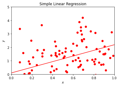
This example serves several aims. It allows us to demonstrate several aspects of data analysis and later machine learning algorithms. The immediate visualization shows that our linear fit is not impressive. It goes through the data points, but there are many outliers which are not reproduced by our linear regression. We could now play around with this small program and change for example the factor in front of \(x\) and the normal distribution. Try to change the function \(y\) to
where \(x\) is defined as before. Does the fit look better? Indeed, by reducing the role of the noise given by the normal distribution we see immediately that our linear prediction seemingly reproduces better the training set. However, this testing ‘by the eye’ is obviouly not satisfactory in the long run. Here we have only defined the training data and our model, and have not discussed a more rigorous approach to the cost function.
We need more rigorous criteria in defining whether we have succeeded or not in modeling our training data. You will be surprised to see that many scientists seldomly venture beyond this ‘by the eye’ approach. A standard approach for the cost function is the so-called \(\chi^2\) function (a variant of the mean-squared error (MSE))
where \(\sigma_i^2\) is the variance (to be defined later) of the entry \(y_i\). We may not know the explicit value of \(\sigma_i^2\), it serves however the aim of scaling the equations and make the cost function dimensionless.
Minimizing the cost function is a central aspect of our discussions to come. Finding its minima as function of the model parameters (\(\alpha\) and \(\beta\) in our case) will be a recurring theme in these series of lectures. Essentially all machine learning algorithms we will discuss center around the minimization of the chosen cost function. This depends in turn on our specific model for describing the data, a typical situation in supervised learning. Automatizing the search for the minima of the cost function is a central ingredient in all algorithms. Typical methods which are employed are various variants of gradient methods. These will be discussed in more detail later. Again, you’ll be surprised to hear that many practitioners minimize the above function ‘’by the eye’, popularly dubbed as ‘chi by the eye’. That is, change a parameter and see (visually and numerically) that the \(\chi^2\) function becomes smaller.
There are many ways to define the cost function. A simpler approach is to look at the relative difference between the training data and the predicted data, that is we define the relative error (why would we prefer the MSE instead of the relative error?) as
The squared cost function results in an arithmetic mean-unbiased estimator, and the absolute-value cost function results in a median-unbiased estimator (in the one-dimensional case, and a geometric median-unbiased estimator for the multi-dimensional case). The squared cost function has the disadvantage that it has the tendency to be dominated by outliers.
We can modify easily the above Python code and plot the relative error instead
import numpy as np
import matplotlib.pyplot as plt
from sklearn.linear_model import LinearRegression

x = np.random.rand(100,1)
y = 5*x+0.01*np.random.randn(100,1)
linreg = LinearRegression()
linreg.fit(x,y)
ypredict = linreg.predict(x)

plt.plot(x, np.abs(ypredict-y)/abs(y), "ro")
plt.axis([0,1.0,0.0, 0.5])
plt.xlabel(r'$x$')
plt.ylabel(r'$\epsilon_{\mathrm{relative}}$')
plt.title(r'Relative error')
plt.show()
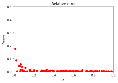
Depending on the parameter in front of the normal distribution, we may have a small or larger relative error. Try to play around with different training data sets and study (graphically) the value of the relative error.
As mentioned above, Scikit-Learn has an impressive functionality. We can for example extract the values of \(\alpha\) and \(\beta\) and their error estimates, or the variance and standard deviation and many other properties from the statistical data analysis.
Here we show an example of the functionality of Scikit-Learn.
import numpy as np
import matplotlib.pyplot as plt
from sklearn.linear_model import LinearRegression
from sklearn.metrics import mean_squared_error, r2_score, mean_squared_log_error, mean_absolute_error

x = np.random.rand(100,1)
y = 2.0+ 5*x+0.5*np.random.randn(100,1)
linreg = LinearRegression()
linreg.fit(x,y)
ypredict = linreg.predict(x)
print('The intercept alpha: \n', linreg.intercept_)
print('Coefficient beta : \n', linreg.coef_)
# The mean squared error
print("Mean squared error: %.2f" % mean_squared_error(y, ypredict))
# Explained variance score: 1 is perfect prediction
print('Variance score: %.2f' % r2_score(y, ypredict))
# Mean squared log error
print('Mean squared log error: %.2f' % mean_squared_log_error(y, ypredict) )
# Mean absolute error
print('Mean absolute error: %.2f' % mean_absolute_error(y, ypredict))
plt.plot(x, ypredict, "r-")
plt.plot(x, y ,'ro')
plt.axis([0.0,1.0,1.5, 7.0])
plt.xlabel(r'$x$')
plt.ylabel(r'$y$')
plt.title(r'Linear Regression fit ')
plt.show()
The intercept alpha:
 [2.10134813]
Coefficient beta :
 [[4.89336973]]
Mean squared error: 0.19
Variance score: 0.91
Mean squared log error: 0.01
Mean absolute error: 0.35
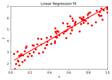
The function coef gives us the parameter \(\beta\) of our fit while intercept yields \(\alpha\). Depending on the constant in front of the normal distribution, we get values near or far from \(alpha =2\) and \(\beta =5\). Try to play around with different parameters in front of the normal distribution. The function meansquarederror gives us the mean square error, a risk metric corresponding to the expected value of the squared (quadratic) error or loss defined as
The smaller the value, the better the fit. Ideally we would like to have an MSE equal zero. The attentive reader has probably recognized this function as being similar to the \(\chi^2\) function defined above.
The r2score function computes \(R^2\), the coefficient of determination. It provides a measure of how well future samples are likely to be predicted by the model. Best possible score is 1.0 and it can be negative (because the model can be arbitrarily worse). A constant model that always predicts the expected value of \(\hat{y}\), disregarding the input features, would get a \(R^2\) score of \(0.0\).
If \(\tilde{\hat{y}}_i\) is the predicted value of the \(i-th\) sample and \(y_i\) is the corresponding true value, then the score \(R^2\) is defined as
where we have defined the mean value of \(\hat{y}\) as
Another quantity taht we will meet again in our discussions of regression analysis is the mean absolute error (MAE), a risk metric corresponding to the expected value of the absolute error loss or what we call the \(l1\)-norm loss. In our discussion above we presented the relative error. The MAE is defined as follows
We present the squared logarithmic (quadratic) error
where \(\log_e (x)\) stands for the natural logarithm of \(x\). This error estimate is best to use when targets having exponential growth, such as population counts, average sales of a commodity over a span of years etc.
We conclude this part with another example. Instead of a linear \(x\)-dependence we study now a cubic polynomial and use the polynomial regression analysis tools of scikit-learn.
import matplotlib.pyplot as plt
import numpy as np
import random
from sklearn.linear_model import Ridge
from sklearn.preprocessing import PolynomialFeatures
from sklearn.pipeline import make_pipeline
from sklearn.linear_model import LinearRegression

x=np.linspace(0.02,0.98,200)
noise = np.asarray(random.sample((range(200)),200))
y=x**3*noise
yn=x**3*100
poly3 = PolynomialFeatures(degree=3)
X = poly3.fit_transform(x[:,np.newaxis])
clf3 = LinearRegression()
clf3.fit(X,y)

Xplot=poly3.fit_transform(x[:,np.newaxis])
poly3_plot=plt.plot(x, clf3.predict(Xplot), label='Cubic Fit')
plt.plot(x,yn, color='red', label="True Cubic")
plt.scatter(x, y, label='Data', color='orange', s=15)
plt.legend()
plt.show()

def error(a):
    for i in y:
        err=(y-yn)/yn
    return abs(np.sum(err))/len(err)

print (error(y))
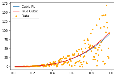
0.004999999999999999
The Boston housing data example
The Boston housing
data set was originally a part of UCI Machine Learning Repository
and has been removed now. The data set is now included in Scikit-Learn’s
library. There are 506 samples and 13 feature (predictor) variables
in this data set. The objective is to predict the value of prices of
the house using the features (predictors) listed here.
The features/predictors are
CRIM: Per capita crime rate by town
ZN: Proportion of residential land zoned for lots over 25000 square feet
INDUS: Proportion of non-retail business acres per town
CHAS: Charles River dummy variable (= 1 if tract bounds river; 0 otherwise)
NOX: Nitric oxide concentration (parts per 10 million)
RM: Average number of rooms per dwelling
AGE: Proportion of owner-occupied units built prior to 1940
DIS: Weighted distances to five Boston employment centers
RAD: Index of accessibility to radial highways
TAX: Full-value property tax rate per USD10000
B: \(1000(Bk - 0.63)^2\), where \(Bk\) is the proportion of [people of African American descent] by town
LSTAT: Percentage of lower status of the population
MEDV: Median value of owner-occupied homes in USD 1000s
We start by importing the libraries
import numpy as np
import matplotlib.pyplot as plt

import pandas as pd
import seaborn as sns
and load the Boston Housing DataSet from Scikit-Learn
from sklearn.datasets import load_boston

boston_dataset = load_boston()

# boston_dataset is a dictionary
# let's check what it contains
boston_dataset.keys()
dict_keys(['data', 'target', 'feature_names', 'DESCR', 'filename'])
Then we invoke Pandas
boston = pd.DataFrame(boston_dataset.data, columns=boston_dataset.feature_names)
boston.head()
boston['MEDV'] = boston_dataset.target
and preprocess the data
# check for missing values in all the columns
boston.isnull().sum()
CRIM       0
ZN         0
INDUS      0
CHAS       0
NOX        0
RM         0
AGE        0
DIS        0
RAD        0
TAX        0
PTRATIO    0
B          0
LSTAT      0
MEDV       0
dtype: int64
We can then visualize the data
# set the size of the figure
sns.set(rc={'figure.figsize':(11.7,8.27)})
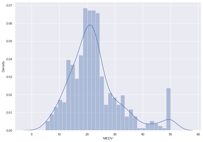
# plot a histogram showing the distribution of the target values
sns.distplot(boston['MEDV'], bins=30)
plt.show()
C:\Users\KarlH\anaconda3\lib\site-packages\seaborn\distributions.py:2551: FutureWarning: `distplot` is a deprecated function and will be removed in a future version. Please adapt your code to use either `displot` (a figure-level function with similar flexibility) or `histplot` (an axes-level function for histograms).
  warnings.warn(msg, FutureWarning)
It is now useful to look at the correlation matrix
# compute the pair wise correlation for all columns
correlation_matrix = boston.corr().round(2)
# use the heatmap function from seaborn to plot the correlation matrix
# annot = True to print the values inside the square
sns.heatmap(data=correlation_matrix, annot=True)
<AxesSubplot:>
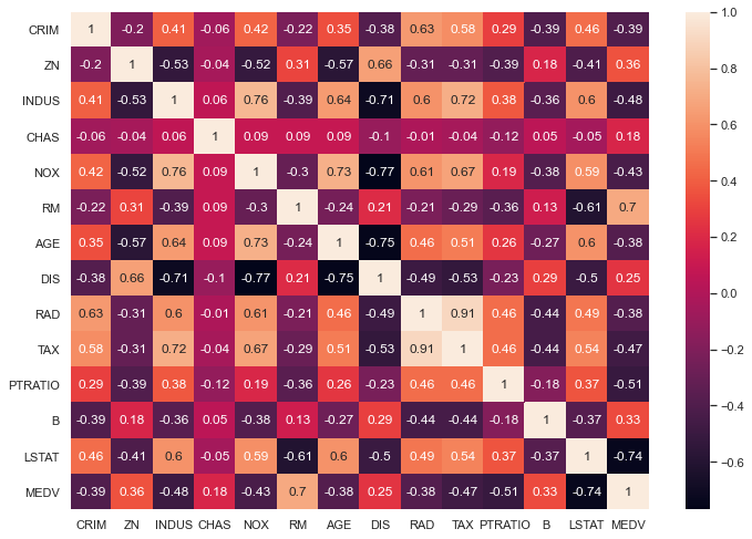
From the above coorelation plot we can see that MEDV is strongly correlated to LSTAT and RM. We see also that RAD and TAX are stronly correlated, but we don’t include this in our features together to avoid multi-colinearity
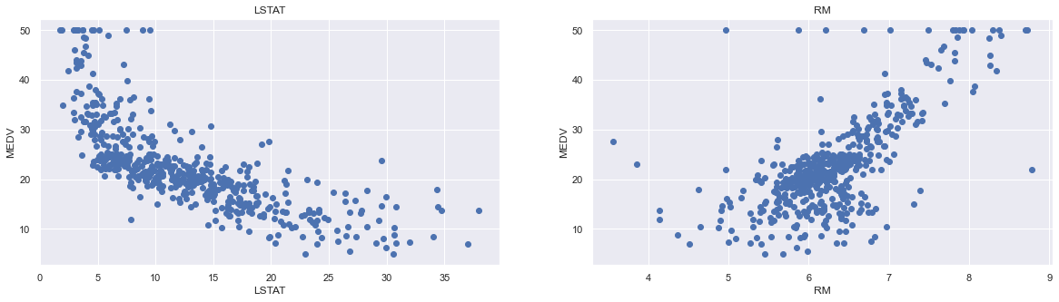
plt.figure(figsize=(20, 5))

features = ['LSTAT', 'RM']
target = boston['MEDV']

for i, col in enumerate(features):
    plt.subplot(1, len(features) , i+1)
    x = boston[col]
    y = target
    plt.scatter(x, y, marker='o')
    plt.title(col)
    plt.xlabel(col)
    plt.ylabel('MEDV')
Now we start training our model
X = pd.DataFrame(np.c_[boston['LSTAT'], boston['RM']], columns = ['LSTAT','RM'])
Y = boston['MEDV']
We split the data into training and test sets
from sklearn.model_selection import train_test_split

# splits the training and test data set in 80% : 20%
# assign random_state to any value.This ensures consistency.
X_train, X_test, Y_train, Y_test = train_test_split(X, Y, test_size = 0.2, random_state=5)
print(X_train.shape)
print(X_test.shape)
print(Y_train.shape)
print(Y_test.shape)
(404, 2)
(102, 2)
(404,)
(102,)
Then we use the linear regression functionality from Scikit-Learn
from sklearn.linear_model import LinearRegression
from sklearn.metrics import mean_squared_error, r2_score

lin_model = LinearRegression()
lin_model.fit(X_train, Y_train)

# model evaluation for training set

y_train_predict = lin_model.predict(X_train)
rmse = (np.sqrt(mean_squared_error(Y_train, y_train_predict)))
r2 = r2_score(Y_train, y_train_predict)

print("The model performance for training set")
print("--------------------------------------")
print('RMSE is {}'.format(rmse))
print('R2 score is {}'.format(r2))
print("\n")

# model evaluation for testing set

y_test_predict = lin_model.predict(X_test)
# root mean square error of the model
rmse = (np.sqrt(mean_squared_error(Y_test, y_test_predict)))

# r-squared score of the model
r2 = r2_score(Y_test, y_test_predict)

print("The model performance for testing set")
print("--------------------------------------")
print('RMSE is {}'.format(rmse))
print('R2 score is {}'.format(r2))
The model performance for training set
--------------------------------------
RMSE is 5.6371293350711955
R2 score is 0.6300745149331701


The model performance for testing set
--------------------------------------
RMSE is 5.137400784702911
R2 score is 0.6628996975186953
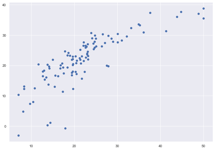
# plotting the y_test vs y_pred
# ideally should have been a straight line
plt.scatter(Y_test, y_test_predict)
plt.show()
Many Machine Learning problems involve thousands or even millions of features for each training instance. Not only does this make training extremely slow, it can also make it much harder to find a good solution, as we will see. This problem is often referred to as the curse of dimensionality. Fortunately, in real-world problems, it is often possible to reduce the number of features considerably, turning an intractable problem into a tractable one.
Later we will discuss some of the most popular dimensionality reduction techniques: the principal component analysis (PCA), Kernel PCA, and Locally Linear Embedding (LLE).
Principal component analysis and its various variants deal with the problem of fitting a low-dimensional affine subspace to a set of of data points in a high-dimensional space. With its family of methods it is one of the most used tools in data modeling, compression and visualization.
Before we proceed however, we will discuss how to preprocess our data. Till now and in connection with our previous examples we have not met so many cases where we are too sensitive to the scaling of our data. Normally the data may need a rescaling and/or may be sensitive to extreme values. Scaling the data renders our inputs much more suitable for the algorithms we want to employ.
Scikit-Learn has several functions which allow us to rescale the data, normally resulting in much better results in terms of various accuracy scores. The StandardScaler function in Scikit-Learn ensures that for each feature/predictor we study the mean value is zero and the variance is one (every column in the design/feature matrix). This scaling has the drawback that it does not ensure that we have a particular maximum or minimum in our data set. Another function included in Scikit-Learn is the MinMaxScaler which ensures that all features are exactly between \(0\) and \(1\). The
The Normalizer scales each data point such that the feature vector has a euclidean length of one. In other words, it projects a data point on the circle (or sphere in the case of higher dimensions) with a radius of 1. This means every data point is scaled by a different number (by the inverse of it’s length). This normalization is often used when only the direction (or angle) of the data matters, not the length of the feature vector.
The RobustScaler works similarly to the StandardScaler in that it ensures statistical properties for each feature that guarantee that they are on the same scale. However, the RobustScaler uses the median and quartiles, instead of mean and variance. This makes the RobustScaler ignore data points that are very different from the rest (like measurement errors). These odd data points are also called outliers, and might often lead to trouble for other scaling techniques.